Dashboard
The project's pulse for a date range: pick a metric, plot it, then break it down.
Dashboard answers "did the number move, and what moved with it". It is the first place to look and almost never the last — the point is to find the change, then leave for the surface that explains it.
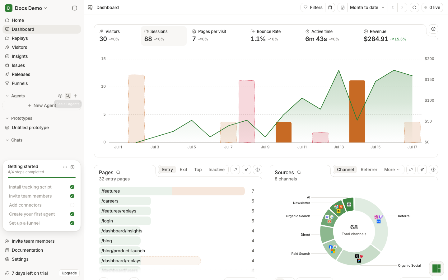
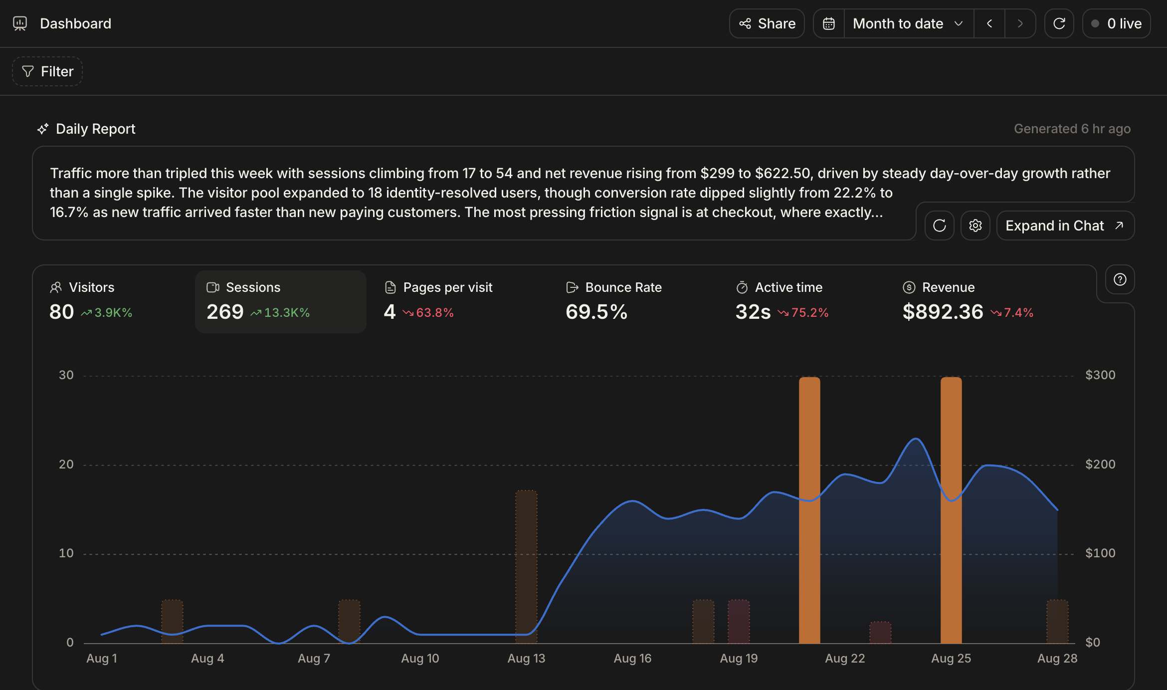
How the page is wired
The KPI row drives the chart: click Visitors, Sessions, Pages per visit, Bounce rate, Active time, or Revenue, and the chart plots that metric over the selected range. Below the chart, breakdown cards split the same range by page, source, event, device, and geography.
The date range at the top governs everything on the page, and it is shared — carry it with you to Replays or Visitors and you keep looking at the same window. Arrows step back and forward by the range you picked.
The Daily Report
At the top of the page, a written summary of the last stretch of data: what moved, by how much, and the friction signal worth caring about. It is generated on a schedule rather than on demand, so it is a briefing, not a live view. Expand in Chat continues it in Home where you can interrogate it.
When a number moves
Dashboard tells you that it moved. To find out why:
- Narrow the range to bracket the change, so you are comparing like with like.
- Use the breakdown cards to find which page, source, or device carries it.
- Open Replays filtered to that slice and watch a few.
- Check Issues for something new in the same window.
A funnel is the sharper tool if the drop is inside a flow you can name — see Funnels.